How much of a subject should be included in the image? That’s always a compositional question: exactly where should you position the edge of the frame? When shooting with a fixed focal length lens, you really don’t have a choice unless you can physically change your location. If you’re using a zoom lens, you have an almost unlimited choice. Of course, no matter the lens you could always crop the image afterwards, but all cropping is lossy and personally I hate to throw away data.
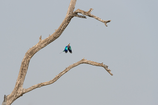
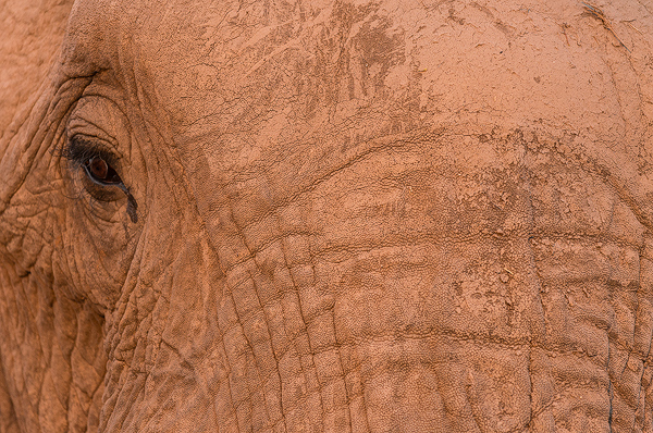
So just how much, or how little, needs to be included? Consider these two images. Your thoughts? Is the roller too small in the frame, the elephant too tight? What do you think?


9 Comments
I like the elephant. Nice graphical design. Not as sure about the bird.
The roller could be a bit tighter, and a bit more elephant maybe (with those great facial lines)
John, I like the elephant. Composition follows the rule-of-thirds, i.e. elephant’s pupil at intersection of upper third of grid leading the viewer to eye. Nice texture and lines add interesting detail. I would have preferred the roller to be a tighter shot. Also, the grayish sky color doesn’t look right. It may have looked that way but I would probably have changed it in the software. Personal choice.
John, both shots are great. As far as I am concerned, there is no right or wrong, per se. Whether the shot satisfies the photographer or not, depends on the goal. If the goal is to show the roller and its environment, this shot works. If the goal is to show the details of the bird, one needs to be a lot closer. Again, on the elephant shot, this is an “elephant head detail” shot and not a shot of the elephant in its environment.
I feel that the bird photo is actually an image of a dead tree since that dominates the composition. There seems to be too much sky and space.
Dennis pointed out that the elephant’s eye was a third of the way down from the top, adhering to the “Rule of Thirds.” I wonder how the image would look if its eye was also a third of the way from the left border. The eye seems to be the point-of-interest, yet it’s situated too far to the left, leaving an extra large expanse of elephant forehead. Just my opinion.
Hi John, the Elephant is my favorite of the two. I just love the tight composition here as it really suits the subject. The small-in-the-frame Roller is also well executed. The branches of the dead tree frame the bird well. I find that is has a wonderful sense of motion to it.
The roller image is more to my liking. The almost parallel curves of the tree limbs impart a downward energy to the open space on the right of the frame. The upward thrust of the bird captured at the key moment and the parallel upward angle of the primary limb balance and oppose this downward energy. Tension is introduced into the image by these opposing energies. Visual art is about energizing space and this image accomplishes that. A tighter shot of the bird would have diminished the energy , tension, and balance (which is transmitted through the negative space of the sky) of the entire image. Very nice image!
I feel the bird image is too small…I find little direction for my eye to follow. Perhaps zoomed in so half the composition is the image?
The elephant image is very powerful. It has the detail I find pleasing , and I don’t get lost in the image as I did with the bird.
A couple of elements about the Roller image bug me. The top of the branch running out of the frame, and the dominating, dull color of the sky. The Roller is colorful, but doesn’t really pop. It’s shape is graceful, and I understand the tree being left in (rather than zooming just to include the bird) as a reference. I might edit the top of the tree to make it terminate before the edge of the frame. But, that dull grey sky would still bug me, I think.
The shot of the elephant is almost perfect. I would hang that up, if I had snapped it.